
The YMCA provides a variety of programs, events, and services that focus on youth development, healthy living, and social responsibility—in other words, we serve all ages in many different ways in order to build up every individual and strengthen the community.
Challenge: To create a visual design for a mobile-responsive platform that reimagines how people can find and engage with fitness recommendations.
My Role: It was my own project, and I learned how to develop a project from sketches to the final prototypes. Also, I had practice in creating a logo for a project.
Everyday life poses numerous obligations for people leaving them with little time to organize a time for themselves and find a spot for a workout. Our persona Erica has a busy schedule with conflicting obligations and finds it difficult to have time to workout to keep in great physical shape while dealing with an ongoing health condition. Iterations were an important part of the design process, I continually improved the designs while moving from wireframes to the final Hi-Fi designs through paper and digital prototyping.


For the logo, I started by doing some sketches shown below. To associate the logo with the general YMCA brand, I used the following adjectives: Social, Development, Healthy, Influential, Diversified, StrongFor the first sketch, I used simple classic figures in order to show cleanliness and to increase the recognition of the site. For the second example, I tried to represent a fitness theme with a minimum number of figures and colors. It covers a broad audience and shows health and is associated with exercises, activity, and even discipline.The third example symbolizes the heart that is associated with health and is perhaps the most suitable option for a health app but not for a fitness app.

My concern with this example was about color. I understood that the color should match with the fitness theme. To solve the problem and make the logo resonate with the target audience I chose a bright blue color that helps reduce daily stress and help cheer up. The logo symbolizes health, strength, trust, constancy, and unity. Also, it is unobtrusive but at the same time unusual.

The logo also works well on different backgrounds which makes it versatile as shown below.


Emphasis is the art of making a specific element stand out or draw attention to the eye.

Alignment creates a sharper, more ordered design. Aligning elements allows them to create a visual connection with each other. Balance provides stability and structure to a design. It’s the weight distributed in the design by the placement of elements.

Helping users navigate should be a high priority for every app. Good navigation should feel like an invisible hand that guides the user along their journey.

Smaller touch targets are harder for users to hit than larger ones. When designing mobile interfaces, it’s best to make targets big enough so that they’re easy for users to tap.
All design solutions are important when developing the final result. I took height level project requirements and the goal was to create a user-friendly and understandable user flow. Every design decision applied at each step of iteration was based on user interviews.


After domain research, I had a better idea of my target users. To improve my understanding I had to conduct user interviews after which I improved my “Survey” screen and added an input field for entering your notes to the questionnaire screens.

I learned that users enjoy the simplicity of choosing the coach for workout and easy to check fitness progress so I aimed to simplify user flow experience but I wanted the UI to feel more fun, friendly and energizing to stand out
Iterations were an important part of my design process, I continually improved the designs while moving from sketches to wireframes to the final Hi-Fi designs through paper and digital prototyping. My final decision was based on users and created for users.


Mid-fidelity wireframes were created from paper sketches. The design decisions and some features explained in the screens below.


It was crucial to find out which user flow to take to accomplish their goals prior to starting any designs. I considered many of the edge cases associated with a fitness app and made prototypes seem simple and intuitive for users.
At the beginning of my project, I created a Login and Signup screens in order to attract the attention of users to log in to the system. Also, they can skip these screens and go directly to the home page.
I learned that users want to see a login reminder after they go to the home page and study the site a bit.


The Home screen and Survey screens are the first screens that users see when they started using the app. For home screen I provided brief information about what is on the site and what courses are available without logging in. Survey screens to find out a training plan for users with health conditions. Users must be sure that workout will not harm their health, and it will be useful. I learned that users like to get a lot of information about a site and the survey is useful not only for users with health conditions but also for healthy people to adjust the training plan and make it useful and showing results.


After a user interview, I refused to divide classes by topics and began to separate them by training days, as it’s more convenient for users to adjust their workouts. I also improved the screens with videos instead of a list of video lessons, and users can also check the lesson description, which makes it possible to study in an environment where there is no way to listen to the video


I created examples of rewards and goals screens as users can control their success. The reason these screens are necessary because users desire a certain outcome or reward. My design helps users stay motivated because they can immediately get quick access to rewards and goals when they loged in.
I learned that users want to see rewards on the central part of the screen so that they can always monitor their own points. Also, a screen with goals should reflect the progress of success, how close the user is to their goals.


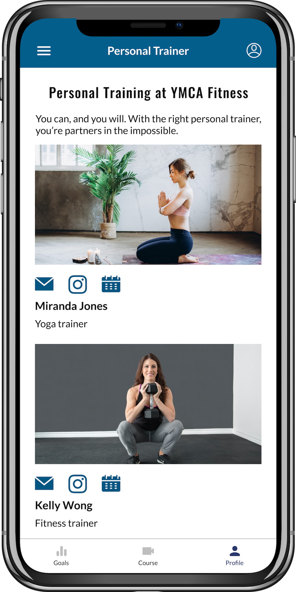
An example of a screen where users said that it’s good to have it and always be in touch with the instructor, the user can always change the instructor or contact him if necessary.The goals of these screens are for users to have quick access to talk with coaches, get advice and recommendations on a further lesson plan without visiting a fitness center, which is so important in their life.

screens are profile page and membership page users have also found them useful, non-distracting and easy to read.
the purpose of these screens is that users have direct access to their profile and can immediately check the goals and successes. After the user interviews, I added statistics and direct access to the membership to fully meet the needs of the users.


It was a challenge for me to work on a project that is already known to everyone and is popular. I gained a lot of experience in how to work with an existing brand and how to make it more attractive and popular for the young generation.


Working on this project, I learned how to create design from a branding to interactive design. I also learned that fitness topics have a very wide space for learning how to stimulate the user for classes and how to encourage users to not give up and bring the goal to the end.
The most important thing I learned is how to lean on the work process. Even in the early stages, when user responses were not what I wanted, I continued to listen to what they wanted to say. From users, I was able to develop a product for users.
Overall, I am very pleased with this fitness app and thoroughly enjoyed creating and designing it. I felt I really captured visual identity of YMCA which was consistent across the website and logo. I think the visual identity also resonates with the target audience which is absolutely key.